We're always on the hunt for a good noodle bowl. This is an app icon to find the best noodles in town whether it be ramen, pho, pancit, bun...You name it, this app will find it.
Challenge #004 Create a calculator
Challenge #003 Landing Page
Update 01/17/17: So here is yet another landing page since I wasn't completely happy with the first two. I think that this is going in the right direction towards a nice homepage.
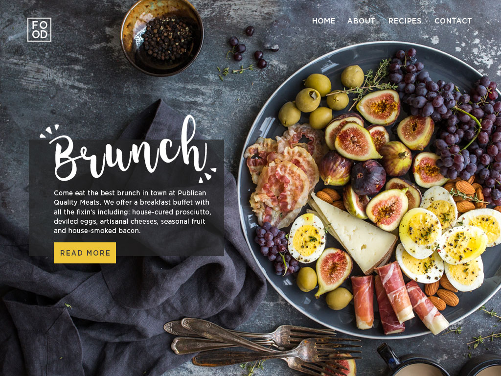
Update Jan. 2, 2017: As I go through and look at more and more UI design, I've found that I want to go back and redo some of these challenges. This is a redo of Challenge #003 Create a Landing page, above the fold. This would be for an idea for a healthy recipe site.
Utilizing an old packaging concept that was not picked, I gave these handheld kids sandwiches a product website. Kid-friendly and with minimal information, I was able to play around with some background textures and incorporate some of the package illustrations into the header section.
Challenge #002 Credit Card Checkout
The first checkout screen is for an AirBnB style website. For these websites, I think it's important to be very clear on what you're being charged for. The left side states how many nights the user is staying, the amount of space they are getting, and when they are booking. The right side restates nights staying and prices in hopes this would limit confusion for the customer.
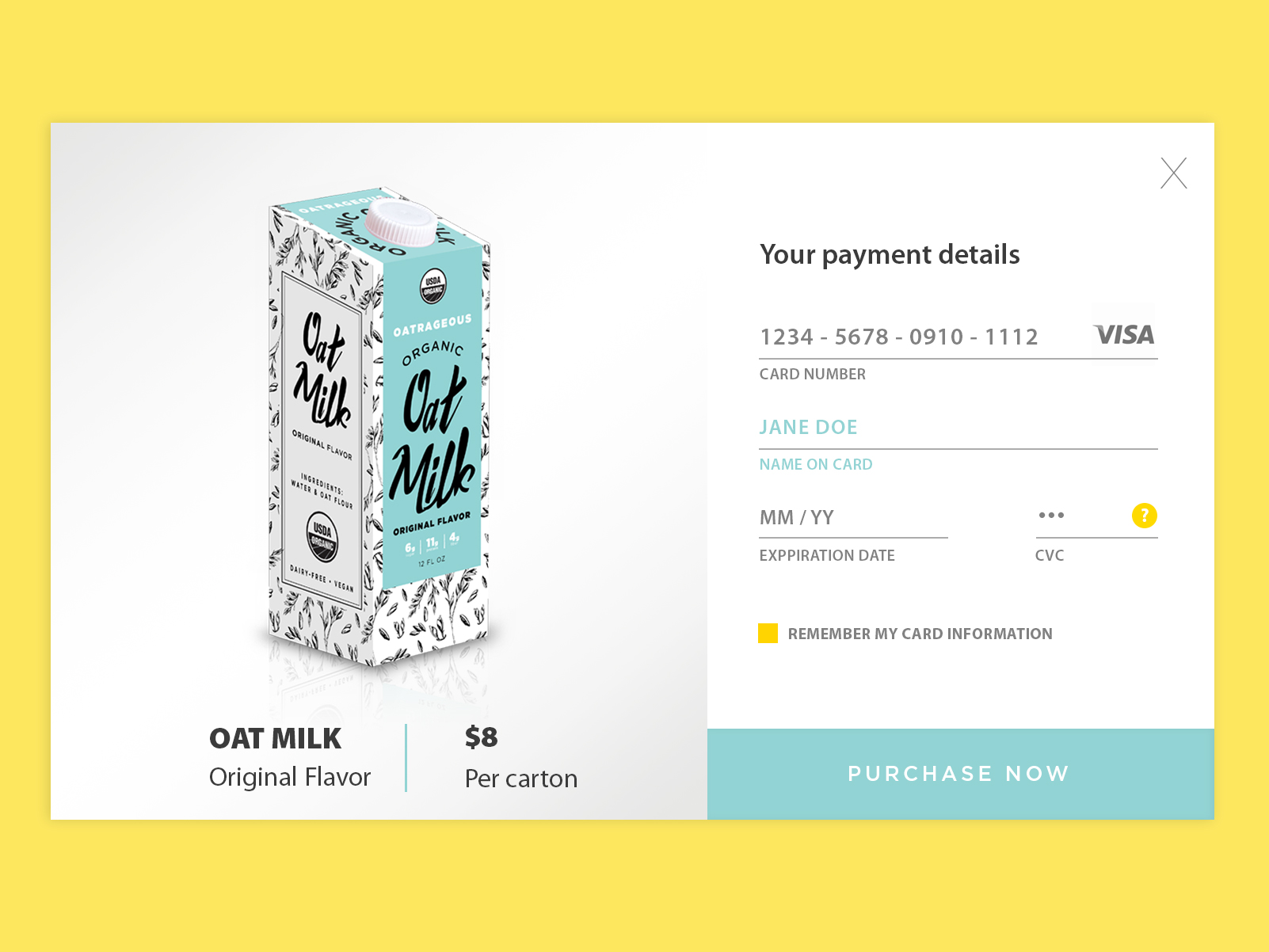
This is a checkout screen for Oatrageous Oat Milk, a package design option for a previous project. I wanted the payment to be simple, clear, and to the point reflecting what is shown in the package design.
Challenge #001 Create a Sign up SCREEN
My first go at the Daily UI Design Challenge. This is meant to be a sign up form for a cycling studio's mobile app. This app would ideally be a place where you could record your workouts results and be able to share with friends. I created the female cycling image and interface in Photoshop.


